


09 Dec Pantone Picked an Old Classic as It’s 2020 Color of the Year
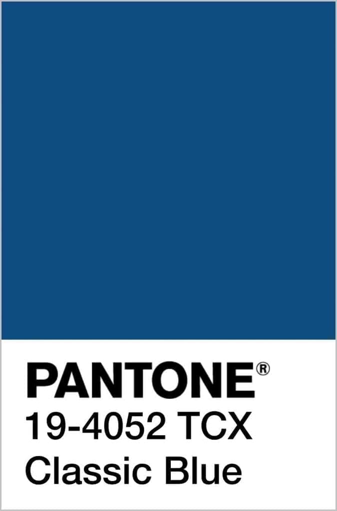
You can expect to see a lot of blue next year. Pantone just announced a timeless and thought-provoking shade, Classic Blue, as their 2020 color of the year. The soothing and reflective tone is reminiscent of the sky at dusk or the deep sea, striking the perfect balance between stability and wonder.
Blue may be the most universal favorite color of all time. Although blue seems to come back around every ten years (Cerulean was Pantone’s pick in 2000, and Turquoise won color of the year in 2010), it is so versatile that a slight difference in the shade can take on an entirely different meaning. Deep and dark blues, like Classic Blue or navy, will incite feelings of intelligence, dependability, and prestige. These twilight-zone tones can also cast a bit of mystery when used in large amounts. Light blues, like sky blue or teal, are seen as safe and serene or can evoke a feeling of freedom.
Because blue can run the gamut from calming to corporate, choosing the right color for your business’ brand is essential. Established corporations may use dark blue accents to reflect their company’s history or reliability, while smaller startups may tend towards the lighter end of the spectrum.
Choose your tone wisely. Want your branding to tell your company’s story? Our team at SmartMarketing has vast experience with incorporating the right colors into logo design and effective brand identity strategies. Contact us to learn how we can help you choose the perfect color palette for your business.


Sorry, the comment form is closed at this time.